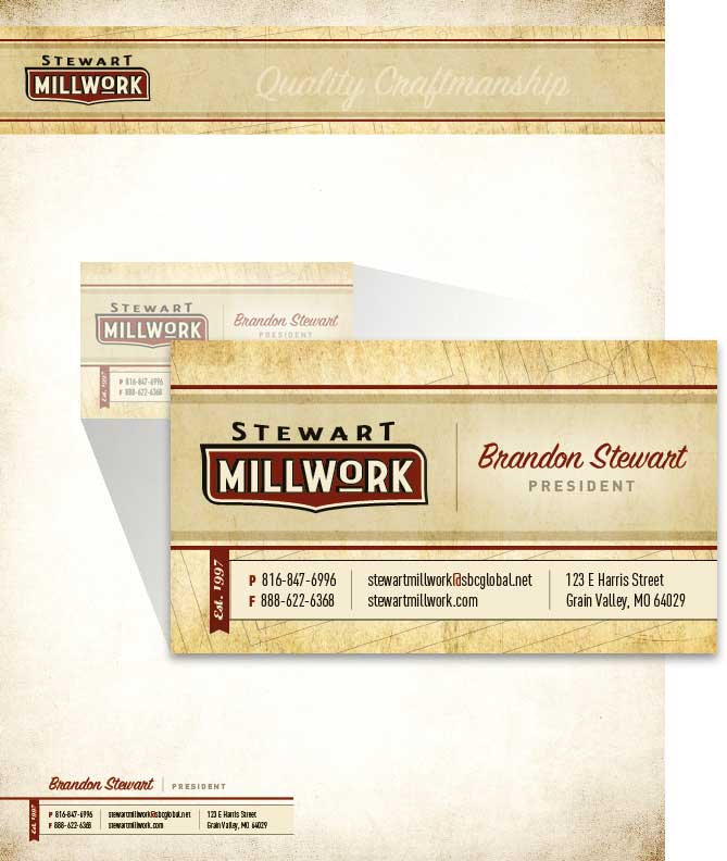
Created for my friend and neighbor, Brandon Stewart, he is one of the best in town at custom cabinetry. He was also very particular about the logo and brand he asked me to create, which I definitely appreciated.
Created for my friend and neighbor, Brandon Stewart, he is one of the best in town at custom cabinetry. He was also very particular about the logo and brand he asked me to create, which I definitely appreciated.

A friend’s son runs this business, Burnt Fingers BBQ, and I was asked to create this post as a Christmas Present for him. If you haven’t heard of it, their “Bacon Explosion” is a bacon-wrapped, bacon-stuffed barbecue sausage. Crazy good.
![]()
A new shop located down the street from where I live needed a solid, no-nonsense logo to get them going. This logo is no frills, but helps them build their brand on TTR and manages to squeeze a lot of information into it at the same time.
![]()
Muddy Toys needed a logo to help launch their new website. They needed something versatile that would work not only for web graphics, t-shirts, and all that fun stuff, but also customer invoices. This logo communicates the name but at the same time will function well in any application.
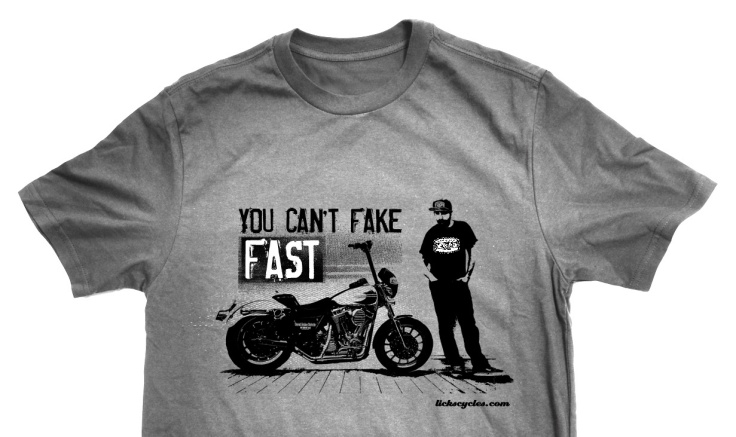
The guys at Lick’s gave this great tagline, You Can’t Fake Fast, and asked me to run with it.
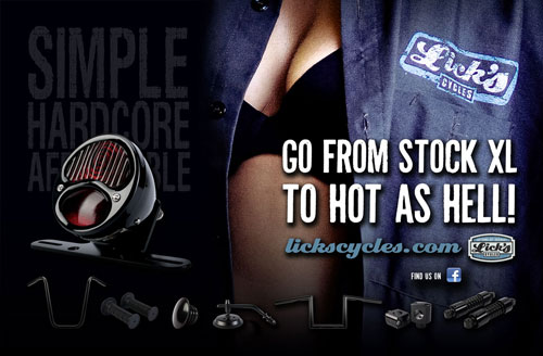
New print ad campaign I created running in Dice, Iron Works, Greasy Kulture and Cycle Source.
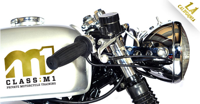
I had the pleasure of creating this logo for Steve Krugman, an accomplished LA-based drummer and certified MSF trainer. He decided to start this business teaching new riders the ins-n-outs of motorcycle handling.


